A carbon tax can be an effective policy for reducing emissions. It also affects output and social welfare.
Like many economists I am fond of diagrams. I feel I understand a piece of economics when I see it expressed in a diagram. Here I present two diagrams that can help in understanding the effects of a carbon tax.
Diagram 1 assists in comparing a marketable permit system (cap-and-trade) and a carbon tax, focussing on their performance under uncertainty. The marginal damage curve is horizontal because atmospheric CO2 is a long-term cumulative pollutant, whereas the diagram is assumed to relate to a short period such as a year.
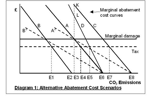 Suppose the marginal abatement cost curve is expected to be A, and a cap-and-trade policy caps emissions at E3, where marginal abatement cost is expected to equal marginal damage. This is expected to reduce emissions at moderate cost from E6 to E3. Suppose however there is an unforeseen recession so that emissions fall anyway to E2, and the actual marginal abatement cost curve is B. In that case the cap at E3 has no effect, and the carbon price falls to zero, removing any incentive for abatement (as occurred in the EU Emissions Trading System with the onset of recession in 2007 (1)). Other possible scenarios are higher than expected economic activity (curve C) or more steeply rising marginal abatement costs (curve D). In these cases the cap at E3 is effective in reducing emissions, but the costs at the margin are high (K and L respectively).
Now consider the effect of a carbon tax. Make the worst-case (but realistic) assumption that we cannot accurately estimate marginal damage, so that the tax rate is liable to be somewhat more or (as in the diagram) less than marginal damage. Such a tax will at least provide a stable incentive yielding a worthwhile reduction in emissions at moderate cost under any of the above scenarios. If the marginal abatement cost curve is A, then tax at the rate shown will reduce emissions from E6 to E4. If it is B, then emissions will be reduced from E2 to E1. For C and D, the reductions are from E8 to E7 and E6 to E5 respectively.
The above is perhaps the main economic reason for preferring a carbon tax to cap and trade. However, the slope of the marginal abatement cost curve is important in two ways. If the slope is shallow, the case against cap-and-trade is weakened (if the expected curve were A* but due to recession the actual curve were B*, a cap at E3 would still yield some reduction in emissions). If the slope is almost vertical, then the reduction in emissions from any moderate tax rate would be small. The case for a carbon tax is strongest when the marginal abatement cost curve is steep but not too steep.
What are the effects of a carbon tax and the abatement it induces on an economy as a whole? The tax itself is simply a transfer from firms to the government, and its effects will depend on related circumstances, such as whether there is an offsetting adjustment to other taxes. The cost of the induced abatement, however, is a real economic cost. In general, abatement may be achieved either by reducing emissions per unit of output, or by reducing output (2). Hence we should expect abatement costs to firms to comprise both technical costs of reducing emissions per unit of output and lost sales income due to reduced output, the profit-maximising combination for any firm depending on its particular technology and market position.
Diagram 2 helps to understand the effect on an economy as a whole of firms adjusting their technology and output in response to a carbon tax (for an analysis at firm level showing that they would adjust both technology and output see this post). It shows combinations of X, representative of goods whose production is carbon-intensive, and Y, representative of low-carbon goods. Initially, with no emissions reduction policy, the production possibility frontier is PPF0. The horizontal dimension is also used to represent emissions, on a scale such that PPF0 also shows the corresponding initial levels of emissions E0. Given a carbon tax, firms would produce somewhat less X, and would produce it with lower per-unit emissions by marginally different techniques requiring additional inputs with an opportunity cost in terms of alternative productive use. Hence the production possibility frontier PPF1 would be to the left of PPF0, and the emissions curve E1 even further to the left.
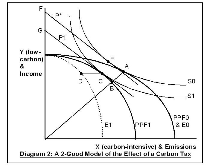 Given social indifference curves Sn as shown, and assuming a perfectly competitive economy, the initial equilibrium is at A where PPF0 touches S0. If the post-tax output proportions were unchanged, production would shift to B. However, only by chance will B be the new equilibrium. As the diagram is drawn, the new equilibrium is at C where PPF1 touches S1, implying that demand for X is moderately elastic. Point D represents the emissions corresponding to C, and the horizontal distance between A and D represents the overall reduction in emissions.
This reduction is achieved at the cost of a welfare reduction from S0 to S1. This can be quantified in terms of Y as the compensating variation (3) by adding budget lines P1 and P*, where P1 is tangential to S1 at C, and P* is parallel to P1 and tangential to S0 (at E). The cost in terms of Y is therefore distance FG.
Diagram 2 admittedly cannot handle radical change from carbon-intensive to low-carbon methods, such as a switch from coal to renewables for generating electricity. Nor does it show technical progress which, on an optimistic scenario, might expand the production possibility frontier without adding to emissions. What it does show, however, is that the cost to society of reducing emissions is a complex matter depending upon, among other things, the elasticity of demand for carbon-intensive goods.
As an example of the relevance of elasticity, consider air travel. One person may be willing to forgo a large quantity of other goods for the sake of fast air travel. Another may enjoy the experience of alternative, lower-carbon modes of travel or be more willing to travel less frequently. If most people are like the former, then the cost to society of reducing emissions will be greater, other things equal, than if most are like the latter.
Addendum 8 February 2014
This post has been significantly edited. The original version conveyed the erroneous impression that the analysis in Diagram 2 helped to explain the slope of the marginal abatement cost in Diagram 1. This impression has now been removed.
Notes and References
- Tilford S, Centre for European Reform (2009) Carbon price collapse threatens the EU’s climate agenda http://www.cer.org.uk/publications/archive/bulletin-article/2009/carbon-price-collapse-threatens-eus-climate-agenda
- Common M & Stagl S (2005) Ecological Economics: An Introduction Cambridge University Press p 415
- For an explanation of compensating variation as a general measure of the welfare effect of a movement between indifference curves (rather than a specific measure relating to a price change) see Wainwright, K, CV & EV, Measuring Welfare Effects of an Economic Change at http://www.sfu.ca/~wainwrig/Econ200/documents/cv-ev-notes.pdf There is no particular reason here to use compensating variation to measure the welfare change rather than the alternative equivalent variation measure.